카테고리 없음
[TypeScript]나만 보는 TypeScript 기초 메모장(Styled-components 기본 문법 모음)
Thompson
2025. 2. 23. 17:01
728x90
반응형
1. 기본 사용법styled.div 사용
2. Props로 동적 스타일props => 조건 ? 스타일 : 스타일
3. 전역 스타일createGlobalStyle
4. 다크 모드 지원ThemeProvider 활용
5. 애니메이션keyframes 활용
6. 반응형 스타일@media 사용
7. 스타일 상속styled(기존 컴포넌트)
8. Mixin 활용css 함수로 공통 스타일 정리
9. as 활용컴포넌트 태그 변경
1. 기본적인 스타일드 컴포넌트 생성
styled.태그명
import styled from "styled-components";
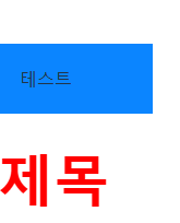
const Container = styled.div`
width: 100%;
max-width: 1200px;
margin: 0 auto;
padding: 20px;
background-color:rgb(11, 133, 255);
`;
const Title = styled.h1`
font-size: 30ㅔㅌ;
color: red;
text-align: center;
`;- styled.태그명 사용하여 스타일을 정의함
- CSS처럼 작성 가능
2. Props를 활용한 동적 스타일 적용
props를 받아 스타일 변경 가능
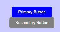
const Button = styled.button<{ primary?: boolean }>`
  background-color: ${(props) => (props.primary ? "blue" : "gray")};
  color: white;
  padding: 10px 20px;
  border: none;
  border-radius: 5px;
  cursor: pointer;

  &:hover {
    background-color: ${(props) => (props.primary ? "darkblue" : "darkgray")};
  }
`;- props.primary가 true이면 blue, 아니면 gray
- hover 상태까지 동적 변경 가능
<Button primary>Primary Button</Button>
<Button>Secondary Button</Button>
3. GlobalStyle 적용 (전체 스타일 관리)
createGlobalStyle을 사용하여 전역 스타일 적용
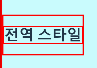
import { createGlobalStyle } from "styled-components";

const GlobalStyle = createGlobalStyle`
  * {
    border: 3px solid red;
  }

  body {
    background-color:rgb(201, 251, 253);
  }
`;- createGlobalStyle로 기본적인 전역 스타일 설정 가능
- body 배경색, 폰트, margin, padding 초기화 가능
const MemoPad: React.FC = () => {

  return (
    <>
      <GlobalStyle />
      <h1>전역 스타일</h1>
    </>
  );
}


export default MemoPad;
4. ThemeProvider 활용 (다크 모드, 색상 관리)
ThemeProvider로 다크 모드, 테마 변경 가능
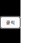
import { ThemeProvider } from "styled-components";

const lightTheme = {
  background: "#ffffff",
  text: "#000000",
};

const darkTheme = {
  background: "#000000",
  text: "#ffffff",
};

const Container = styled.div`
  background-color: ${(props) => props.theme.background};
  color: ${(props) => props.theme.text};
  min-height: 100vh;
  display: flex;
  align-items: center;
  justify-content: center;
`;

const MemoPad: React.FC = () => {
  const [isDark, setIsDark] = useState(false);

  return (
    <ThemeProvider theme={isDark ? darkTheme : lightTheme}>
      <Container>
        <button onClick={() => setIsDark(!isDark)}>클릭</button>
      </Container>
    </ThemeProvider>
  );
}

export default MemoPad;- ThemeProvider를 활용하면 다크 모드, 컬러 테마 적용 가능
- props.theme을 통해 테마 기반으로 스타일 변경
5. Styled-components에서 애니메이션 적용하기
keyframes 사용하여 애니메이션 추가!
import styled, { keyframes } from "styled-components";

const fadeIn = keyframes`
  from {
    opacity: 0;
  }
  to {
    opacity: 1;
  }
`;

const AnimatedDiv = styled.div`
  width: 200px;
  height: 200px;
  background-color: #007bff;
  animation: ${fadeIn} 2s ease-in-out;
`;

const MemoPad: React.FC = () => {
  return (
    <>
  		return <AnimatedDiv />;
    </>
  );
}
export default MemoPad;- keyframes를 사용해 CSS 애니메이션 적용 가능
- animation 속성으로 애니메이션 실행(점점 밝아지는 모션)
6. 반응형 디자인 (Media Query 사용)
@media로 다양한 화면 크기에 대응
const ResponsiveBox = styled.div`
  width: 100%;
  height: 300px;
  background-color: lightcoral;

  @media (max-width: 768px) {
    background-color: lightblue;
  }
`;- 화면 크기에 따라 스타일 변경 가능 (예: 모바일 최적화)
<ResponsiveBox />- PC : lightcoral
- 모바일 (768px 이하) : lightblue
7. 스타일 상속 (컴포넌트 확장)
기존 스타일을 상속받아 변경 가능
const BaseButton = styled.button`
  padding: 100px 20px;
  border: none;
  border-radius: 5px;
`;

const PrimaryButton = styled(BaseButton)`
  background-color: blue;
  color: white;
`;

const DangerButton = styled(BaseButton)`
  background-color: red;
  color: white;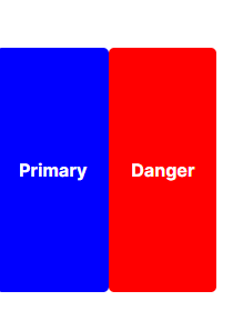
`;- BaseButton 스타일을 확장하여 Primary, Danger 버튼 생성 가능
<PrimaryButton>Primary</PrimaryButton>
<DangerButton>Danger</DangerButton>
8. CSS 속성 여러 개 적용 (Mixin 활용)
중복되는 스타일을 css 함수로 정리
import { styled, css } from "styled-components";

const flexCenter = css`
  display: flex;
  align-items: center;
  justify-content: center;
`;

const Box = styled.div`
  ${flexCenter};
  width: 100px;
  height: 100px;
  background-color: tomato;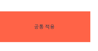
`;- 공통 스타일을 변수로 관리 가능
- 코드 중복 방지
9. Styled-components에서 컴포넌트에 as 적용하기
as 속성으로 다른 태그로 변경 가능
const Text = styled.p`
  font-size: 18px;
  color: red;
`;
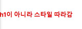
<Text as="h1">h1이 아니라 스타일 따라감</Text>- <Text> 컴포넌트를 <h1>로 바꿔도 스타일 유지
- 기본 태그 변경 가능